Alright, let's be blunt. Your website isn't just a collection of pixels and promises. It's a psychological battlefield, and its most potent weapon? Colour. Before your customer even reads your sparkling prose or clicks a single button, your website's palette is whispering secrets, screaming intentions, and subtly, yet powerfully, manipulating their mood. Forget feng shui; we're talking full-blown mind-control. Colour psychology is real, and your digital storefront is playing puppet master, whether you know it or not.
In the cut-throat world of online presence, a 'nice-looking' website is about as useful as a chocolate teapot. Your site needs to perform. It needs to convert browsers into buyers, turn casual clicks into committed customers. And the silent, often overlooked, architect of that conversion is your colour scheme. This isn't just about pretty pictures; it's about strategic design, tactical psychology, and making your pixels work harder than a Whitehouse press secretary after another tariff outburst. Let's delve into the audacious world of colour in web design and discover why your choices here are either marketing genius or a digital fashion faux pas.
The Secret Life of Hues: Your Website's Inner Voice
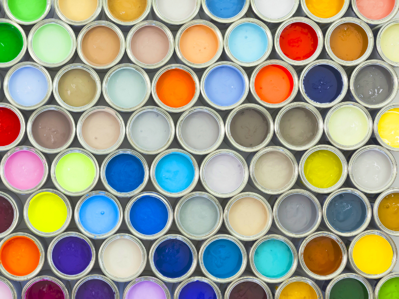
Every hue, every shade, every splash of brilliance carries baggage – emotional baggage, psychological baggage, even cultural baggage. Warm colours (think fiery reds, sunny yellows, zesty oranges) are your website's extroverts: loud, energetic, and itching for action. Cool colours (like calming blues, verdant greens, mysterious purples) are the introverts: sophisticated, stable, and perhaps a touch contemplative.
In the UK, we're broadly wired into Western colour associations, but even here, context is king. A baby blue might be serene, but slapped onto a heavy plant machinery site, it's just... confused. The trick is to understand your website's hidden language and ensure it's not muttering nonsense to your audience.
Unleash the Chromatic Commanders: What Each Colour Really Says
Let's dissect the pixel personalities that can make or break your online narrative:
- Blue: The Trust Architect, the Corporate Confidant. Want your website to whisper, "Trust me, I'm practically a bank vault, but far less stuffy"? Drench it in blue. It’s the go-to for financial institutions, tech giants (ever notice social media titans love it?), and any brand wanting to project stability, professionalism, and unwavering security. Lighter blues are airy and friendly; darker shades mean business. The only caveat? Overdo it, and you might accidentally design something as cold as a February morning in Aberdeen.
- Red: The Urgent Whisper, The 'Buy Now' Siren. Need a customer to click 'Buy Now' before their tea gets cold? Unleash the red. This colour is pure adrenaline. It screams energy, passion, urgency, and sometimes, a polite warning. It’s the digital equivalent of a shouted instruction – perfect for CTAs, sale banners, or highlighting 'limited stock!' In the automotive sector, it implies speed and raw power. Use it like a seasoned chef uses chilli – strategically, for maximum impact, not to burn down the house.
- Green: The Eco Warrior, The Money Grower, The Calm Guru. Selling kale smoothies, electric vehicles, or financial growth? Go green. It practically smells of fresh air, organic produce, and healthy bank balances. It's the universal sign for nature, prosperity, and calm. Darker greens exude a sense of wealth and tradition, while lighter shades feel vibrant and refreshing. It’s the colour that tells your visitor, 'Everything's going to be alright, and you might get rich.'
- Yellow: The Sunshine Bandit, The Attention Grabber. This is the cheeky chappy of the colour wheel. Yellow radiates happiness, optimism, and is a surefire way to grab eyeballs. It’s brilliant for highlighting urgent notices or for brands that want to feel youthful and playful. But here’s the warning: too much, and your website could feel like a constant, slightly irritating honk. Use it like a dash of saffron – potent and precious.
- Orange: The Enthusiastic High-Five, The Creative Spark. Think of orange as red's playful cousin and yellow's energetic mate. It’s less aggressive than red but still packed with enthusiasm, warmth, and creativity. Excellent for friendly CTAs, especially for brands targeting a younger, more adventurous audience. It inspires confidence and a sense of approachability. It’s the digital equivalent of a cheerful thumbs-up.
- Purple: The Royal Enigma, The Creative Genius. Want your website to reek of sophistication, luxury, and 'I've arrived'? Purple is your VIP pass. Historically tied to royalty, it now conveys creativity, wisdom, and opulence. High-end brands, innovative tech companies, and anything with a touch of mystique often dabble in purple. It’s the colour that makes your product feel exclusive, like it comes with its own velvet rope.
- Black: The Power Suit, The Elegant Enigma. The little black dress of web design. Sleek, powerful, and effortlessly elegant. Black is the master of sophistication, mystery, and formality. Ideal for luxury brands, high-tech showcases, or minimalist designs where content needs to pop. Beware: too much black, and your website might accidentally host a digital funeral. It needs contrast to truly shine.
- White: The Breath of Fresh Air, The Clarity Champion. The ultimate minimalist hero. White is fundamental as 'negative space,' allowing your content to breathe, your images to sing, and your message to land with crystal clarity. It screams purity, simplicity, and efficiency. It’s the silent backbone, the uncluttered desk that allows brilliant ideas to emerge.
- Grey: The Quiet Genius, The Sophisticated Neutral. Not boring. Never boring. Grey is the quiet genius of the palette, symbolising balance, maturity, and understated sophistication. Light greys make for brilliant, subtle backgrounds, providing a softer contrast than harsh black. Darker greys add gravitas without the intensity of black. It’s the understated confidence, the background hum of pure class.
- Brown: The Earth Mother, The Reliable Friend. Earthy, honest, and possibly smells of freshly brewed coffee. Brown is naturally associated with reliability, comfort, and authenticity. Great for organic brands, artisanal products, or anything wanting to convey heritage and grounded values. It’s the digital equivalent of a comfy armchair and a good chat.
Painting with Purpose: Your Website's Strategic Masterclass
Colour isn't just paint; it's persuasion. It's the strategic secret sauce that elevates your web design from art project to conversion machine:
- Brand DNA: Your colour palette is your brand's genetic code. It immediately communicates who you are, what you stand for, and what experience users can expect.
- CTA Magnetism: A strategically contrasting colour for your 'Call to Action' buttons is non-negotiable. It should leap off the page, guiding the user's eye directly to the conversion point.
- UX Choreography: Colours create visual hierarchy, drawing attention to critical elements (e.g., pricing, key features) and subtly directing the user's journey across the page.
- Accessibility Isn't Optional: This isn't just good manners; it's vital. Ensure sufficient colour contrast for readability, especially for users with visual impairments. Your digital masterpiece should be usable by everyone.
- The Cohesive Canvas: Consistency is king. Your chosen palette must extend across your entire website, social media, and all marketing materials. Anything less is a chaotic mess.
Digital Fashion Faux Pas: Colour Calamities to Avoid
Even the best intentions can go awry. Dodge these common colour calamities:
- The Rainbow Vomit Effect: Too many colours. It's overwhelming. It dilutes your message. It screams 'amateur hour.' Stick to a tight, purposeful palette.
- The Industry Rebel (Without a Cause): While innovation is cool, blindly ignoring industry norms can confuse. A neon pink funeral home site might raise eyebrows.
- The Invisible Ink Blunder: Light text on a light background. Dark on dark. This isn't artistic; it's unreadable. Prioritise contrast for weary eyes.
- The Cultural Blindspot: For international audiences, a quick check on cultural colour meanings is non-negotiable. What's lucky here might be rude elsewhere.
- The 'Gut Feeling' Gamble: Don't just pick colours because you like them. Test them. A/B test different CTA colours, banner shades. Let data prove your genius.
Conclusion: Your Pixels Are Talking. What Are They Saying?
Still think colour is just 'nice to look at'? Think again. Your website's colours are your silent sales team, your emotional architects, your brand's first impression. Strategic colour in web design is an investment in user experience, brand perception, and ultimately, your bottom line. It's time to ensure your pixels are speaking volumes, and saying precisely the right thing.