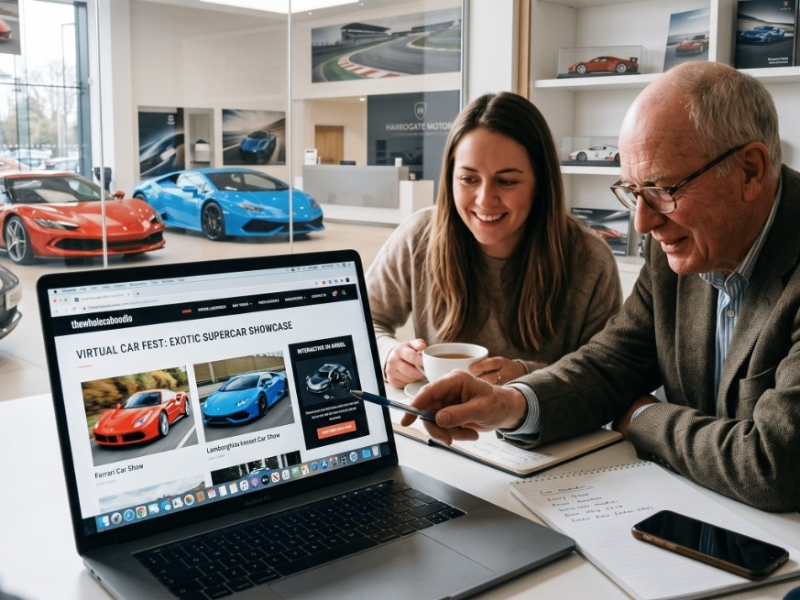
Looks matter. Not just the cars, but your website too. The right visual choices build trust, make your site easier to use, and help visitors feel like they’re in the right place.
Colour Choice = Emotion
Blue: Trust, calm – often used by finance companies.
Red: Action, urgency – good for limited offers.
Grey/Silver: Professional, neutral – great for prestige stock.
Choose a palette that suits your brand and stick to it. Don’t use five different shades of green just because you can.
White Space Isn’t Wasted Space (Oh how I wish people understood this more!!!)
Give things room to breathe. Don’t cram everything together. Space between elements helps users focus and makes everything feel more premium.
Fonts That Work
Use modern, easy-to-read fonts. Avoid anything too fussy or quirky. Sans serif fonts (like Arial, Helvetica, Roboto) work well. Keep it consistent across your site.
Font size matters too – if someone has to zoom in on mobile, you’ve lost them.
Visual Hierarchy
Use bold for key points, larger font for headlines, and smaller font for supporting info. Icons (like mileage, fuel, gearbox) help people scan quickly.
Imagery
Invest in clean, well-lit photos. Ditch the dealership car park background. Use consistent angles and make sure photos load fast.
Final Thought
Your design isn’t just decoration – it’s part of how people judge your business. A tidy, attractive site builds confidence. A messy one raises red flags. Get the visuals right, and the trust will follow.