Your website should be your best salesperson, not your most expensive brochure. Yet many dealer sites feel slow, confusing, or a bit shouty. Shoppers bounce, leads stall, and stock sits. That hurts. The fix is not one magic trick. It is a tight set of choices that work together. If you want a shortcut on the fundamentals, start with these 10 secrets to building high-performing car dealership websites. Then build your own site around real buyer behaviour, fast tech, and a clear path to conversion.
Key Takeaways
- Make it fast, clear, and mobile ready so shoppers can find the right car in seconds.
- Treat your search bar like the hero. It is where serious buyers start.
- Use simple paths, strong CTAs, and finance tools to turn views into enquiries.
- Personalise content with machine learning to lift engagement and lead quality.
- Measure what matters and tune your site weekly, not yearly.
- Great photos, video, and transparent pricing build trust faster than slogans.
- Small UX fixes compound into big sales results over time.
High-Performing Automotive Dealership Website Basics
Think of your site like a friendly showroom. People should know where to walk, who to talk to, and what to do next. Follow automotive website design best practices so every page gently guides shoppers from search to shortlists to action.
Set clear goals. Book test drives. Get finance pre-approvals. Capture part-ex valuations. Every feature should help one of these outcomes. If a widget does not help, it goes.
Navigation And Search That Feel Effortless
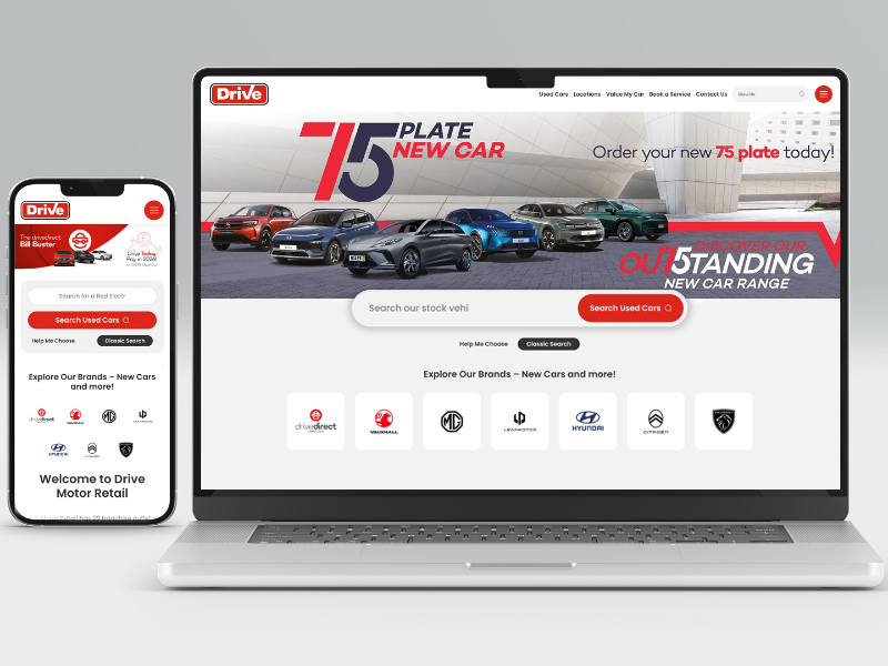
Your top nav should focus on stock, finance, aftersales, and contact. No mystery labels. The search bar needs pride of place, high contrast, and smart suggestions. There is a good reason experts say why your car search bar is more important than your home page banner. It is where buyers show intent in plain text.
Use faceted filters that remember choices. If I say I need an automatic SUV under £20k, keep that set as I browse. It saves time and reduces friction.
Speed, Performance, And Mobile UX
Most car shopping happens on phones. If your site loads like a sleepy diesel on a cold morning, people leave. A snappy site wins trust and clicks. Start with a clean codebase, next-gen images, and good caching. Then test on real devices, not just a desktop.
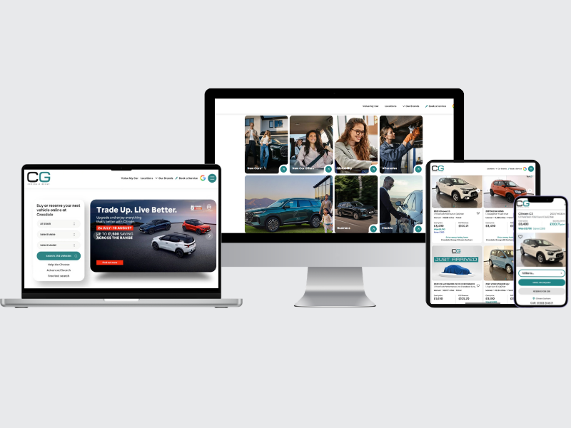
Design mobile first. Big tap targets, sticky CTAs, and a simple filter panel make all the difference. If you need a push, the case for mobile-first car dealer websites is very clear.
- Aim for under 2.5 seconds to largest contentful paint on key pages.
- Keep hero images under 200 KB and use lazy loading.
- Make CTAs thumb friendly and visible without scrolling.
- Trim third-party scripts that add bloat with no business value.
Picture Sophie on a lunch break. She has five minutes and patchy signal. If your VDP loads in a blink, shows price, mileage, and a finance snippet, you win that moment. If not, she is gone, and she will not send a goodbye note.
Smarter Shopping With AI And Machine Learning
AI is not a buzzword when it helps a real shopper find a real car faster. Tools that learn from behaviour can reorder stock, suggest trims, and surface the next best action. If you want a primer, look at these examples of AI-powered automotive websites.
Machine learning can spot that visitors who view compact hybrids often respond to home charging content. Show that guide. It can see that buyers who filter by monthly payment want a quick finance check. Offer a soft credit search and reassure them it will not leave a mark. If you want to see how it scales, read about turning dealer websites into 24-7 sales engines with AI and machine learning.
Here is the human side. AI should serve your best salesperson, not replace them. Think of it as the colleague who remembers everything and nudges at the right time. Helpful, quiet, and very on brand.
Tailored Content That Converts
Personalisation is simply good manners at scale. Show diesel-friendly service plans to high-mileage drivers. Highlight family features to shoppers who keep filtering for boot space. Use banners and modules that change based on location, stock mix, and intent. The data is there. Use it to help, not to stalk.
Want proof it works? See the power of tailored content and personalisation to lift conversions across the funnel. Start small. Swap one generic hero for a dynamic message tied to search terms. Then add personalised finance nudges on VDPs. Track the impact and expand.
One more tip. Speak like a person. Instead of “Qualify for credit now,” try “Check your eligibility in 60 seconds. No mark on your score.” Clear beats clever every time.
Content And Features That Build Trust
Shoppers buy when they feel safe and informed. Strong VDPs should include 20 to 30 photos, a short walkaround video, a spec checklist, and transparent pricing. Show a monthly figure with an APR range. Let people pre-qualify in a soft search flow.
Reviews matter. Pull in recent, verified feedback and highlight what buyers loved. Add simple icons for key benefits like home delivery, 14-day exchange, or free MOT. These small proof points remove doubt and keep the journey moving.
Finance and part-ex deserve care. Use a smooth valuation tool that does not ask for a life story. On finance, cut the jargon and show an explainer. A two-minute video often beats a 20-line paragraph.
Visual Design And UX That Sells
Good design is quiet. It points the eye to the next action and keeps the brand calm and consistent. Use colour to guide, not to shout. Buttons should look like buttons. Links should look like links. For vehicles, square or 4:3 photos tend to scan best on mobile.
| Feature | Why It Matters | Practical Example |
|---|
| Prominent Search Bar | High-intent users start with search | Sticky search at the top with make, model, budget autocomplete |
| Fast Vehicle Detail Pages | VDPs drive most leads | LCP under 2.5s, first image under 100 KB, preloaded next image |
| Mobile-First Layout | Most visits are on phones | Thumb-friendly filters, sticky CTA, collapsible spec blocks |
| Finance Preview | Price clarity increases enquiries | Monthly estimate with APR and a soft credit check CTA |
| Personalised Modules | Relevance boosts engagement | Dynamic offers based on segment, location, or browsing history |
From Stock Discovery To Lead: Smoothing The Path
Once a shopper lands on a list page, speed is key. Let them add to a shortlist, save searches, and set alerts. Email and SMS alerts catch those hot buyers when the right car appears. Keep forms short and explain why you need each field. If it feels nosey, it probably is.
On VDPs, place two or three primary CTAs. Book a test drive. Reserve now. Get a finance check. Avoid choice overload. If you must ask more, use a tidy accordion. It keeps focus without burying details.
Data, Testing, And Continuous Improvement
You do not need a data science team to improve your site. Start with a scorecard of speed, conversion, and content health. Track the big ones each week. Run one test at a time so you know what moved the needle.
Not sure what to measure first. This guide to website performance metrics that make or break car dealers is a solid baseline. Watch VDP views, enquiry rate, time to first paint, and form completion. If you cannot explain a metric to your sales team in one sentence, it is probably not the north star.
Use simple A/B tests. Try a new headline on the home page for a week. Switch the order of filters. Test a shorter finance form. Keep the winners and move on. It is a tidy habit that builds a better site month by month.
Real-World Scenarios To Guide Decisions
Evening browser: Alex scrolls on the sofa, TV on, attention split. He needs a fast search and bold photos. Keep copy short, save the detail for the VDP.
Weekend buyer: Priya visits three sites on Saturday morning. She compares monthly payments, APRs, and warranty. If your finance info feels cloudy, she will skip it. Transparency wins that race.
Service customer: Dan wants a simple booking. Do not hide the aftersales link. Offer a one-minute form and show first available slots. Cross-sell gently with a seasonal offer, but do not block the path.
Team, Process, And Culture
A great site is a team sport. Marketing brings the story. Sales brings the objections. Ops brings the reality on stock and prep. Meet monthly, share the numbers, and agree the next two or three actions.
Document your playbook. How to upload photos. How to write VDP copy. How to tag specials. When new people join, they can ship quality on day one. That keeps standards high when life gets busy.
Bringing It All Together
The best dealer websites feel simple on the surface and clever underneath. They get buyers to the right car fast, answer questions before they are asked, and make the next step feel safe. With clear UX, quick pages, and helpful AI, you create a journey that respects time and builds trust.
If you are starting from scratch, use a checklist. If you already have a site, fix the slow bits and polish the paths. Then add automation where it truly helps. Step by step, you will see more enquiries and better margins.
Ready To Build A High-Performing Automotive Dealership Website?
Let us help you turn your site into the quiet closer on your team. If you want fresh ideas, we can review your current UX, speed score, and content, then map quick wins and smart upgrades. Or, if you prefer to DIY, keep this guide handy and iterate each week. Your future customers will feel the difference, and so will your sales board.